Geographers like me are really interested in understanding landscape changes. I’ve been doing some research on how the infrastructure of digital life (e.g., data centers or semiconductor fabs) is inscribed into real locations, what that process of inscription looks like, and why it matters (to whom, where, when, and under what conditions).
In experimenting with different publicly available data sources I’ve cobble together a set of steps that someone with fairly basic computer skills and no knowledge of coding can use to find infrastructure (like data centres or semiconductor fabs) and map landscape change over time. In what follows, I try to lay out the steps I’ve used in case other people might find them useful for their own purposes.
I’ve broken the steps into three main parts. Parts 1 and 2 use QGIS, a free open source geographic information system software. The steps I describe using QGIS do not require any particular prior knowledge of GIS to accomplish them. In Part 3 I show how the location data extracted in Parts 1 and 2 can be used to collect high resolution satellite images of those locations using Google Earth Pro and other free software.
Before jumping in, I’ll just offer the caveat that the steps I have cobbled together and the pieces of software I’ve chosen to use are not the only ways to go about the kind of data gathering described here. What I’m trying to do in what follows is layout some relatively simple and free steps for data collection and analysis by people who do not necessarily have prior experience doing so.
Part 1
Step 0.0 download and install QGIS: https://qgis.org/download/
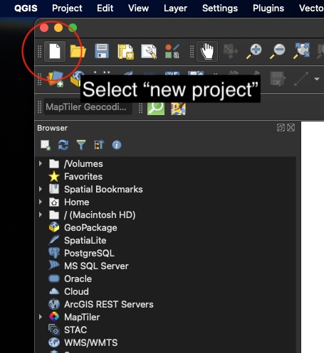
Step 1.1 open QGIS and select “new project”
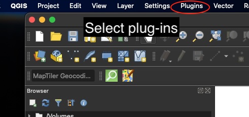
Step 1.2 select plug-ins and “manage and install plug-ins”
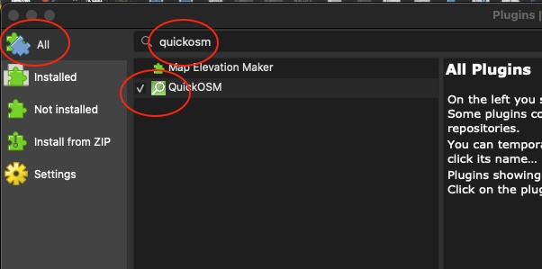
Step 1.3 find the list for “all” plug-ins and in the search bar search for “quickosm” and use the one-click install button (near bottom right, out of screenshot view).
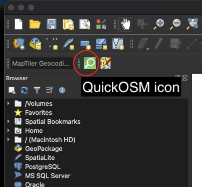
Step 1.4 Close the plug-in menu and return to the QGIS main screen. You should see an icon for QuickOSM in the toolbar, something like this (if you do not, make sure that all of the necessary toolbars are visible; QGIS’s built in help menu is very useful in showing where specific menu items are located and can be activated/deactivated.)
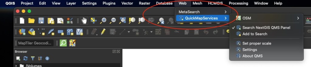
Step 1.5 If all you want to do is collect data on data centre locations (or another spatial entity) and be able to output a spreadsheet of those data, you are ready to go. On the other hand, if you want to be able to make maps within QGIS itself, then it can be very useful to install another plug-in called “QuickMapServices”. The “QuickMapServices” plug-in lets you use Open Street Map and a wide variety of other freely available maps as base maps for your work. Once installed, the “QuickMapServices” plug-in is available under the “Web” menu of QGIS (see screenshot below). I will also note the option of opening the “Search NextGIS QMS Panel” (see screenshot below) through which you can search for all sorts of other GIS ready data, including other base maps (I am a fan of ESRI’s “Gray (dark)” base map for example – – it can be found by searching “esri” in the”Search NextGIS QMS” panel if you open it).
PART 2
Let’s find some data centres…
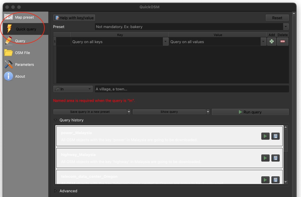
Step 2.1 click the “QuickOSM” icon. This will launch a pop-up menu. On the pop-up menu select “Quick query”.
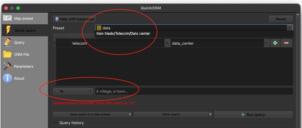
Step 2.2 in the “Preset” search query box type “data”. This will trigger a built-in preset search query for “Man Made/Telecom/Data center” (yes, the gendering is built-in). Select that category and then look below it to the button for the spatial extent of the search (the default is called “In”). You can use the default setting of “in” to search for data centres in a given location. As the menu suggests in the screenshot that location can be a village or town, but it can be other common geographical containers, like states, provinces or countries. Once you have your search parameters, click “Run query”. I’ll use Canada for the next steps.
Step 2.3 after running the query, QuickOSM will output data that matches your query into the “Layers” panel of QGIS. If you have the map canvas open, you may also see some of the data you output plotted on an otherwise blank canvas (there will be no map unless you have a base map layer activated). From this point onward, you can make maps with your data within QGIS or export the data in various formats, including plain old spreadsheets.
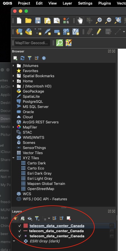
Step 2.4 to get a spreadsheet version of the data, right click on any of the three layers and select “Open Attribute Table from the pop-up menu. If you want to include latitude/longitude coordinates for each row of data, follow these steps: https://medium.com/@samath/qgis-adding-latitude-and-longitude-to-your-attribute-table-80d4ddbdc02b
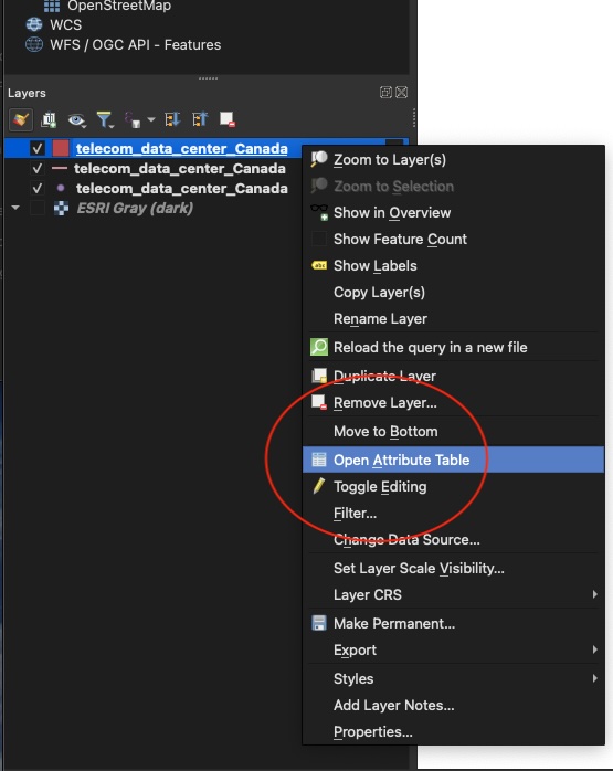
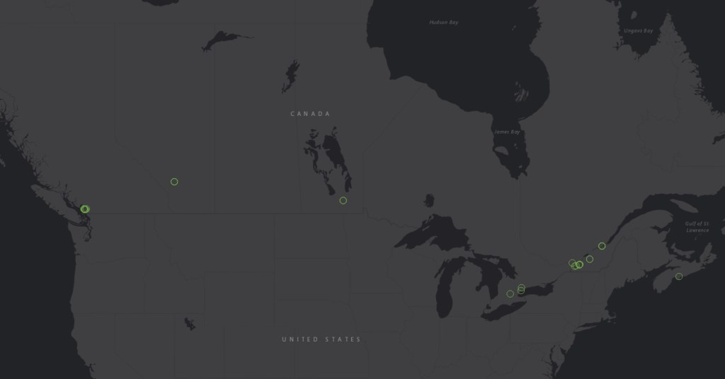
Here’s a map done quickly using ESRI gray (dark) as the base map. The data centres are the bright green circles. I have resized them just to make them more visible at this scale. Many of them are located closely together so at this scale the circles representing the data centres overlap one another.
How good are the results from the steps above? There are different ways to answer that question depending on the information you’re looking for with respect to data centers. That said, for a set of steps that require no paid subscriptions, then the results are pretty good.
There are other sources of data centre location data. Those sources have a lot of variety in terms of what information they will provide for free and what one has to pay for. Also, different sources that claim to have comprehensive (not the same as ‘complete’) location, data for data centres offer up a pretty wide range of total number of such locations in a given geography or jurisdiction. For example, datacentres.com (https://www.datacenters.com/locations/canada) claims there are 252 data centre locations in Canada. Visiting the site will also provide you with basic information such as street address and, sometimes, other information like total square footage and electrical capacity for free. On the other hand, some of the information from this website is clearly wrong. For example, it claims that one data centre in Quebec City is “307.58 miles to the nearest airport” (the closest airport is actually Quebec City International, YQB, which is less than 20 km or about 12 miles from the data centre location). Meanwhile, a site called PoiData.io claims there are only 30 data centres in Canada (https://poidata.io/report/data-center/canada). The sample data provided gives the business name and the city that it is located in as well as some website information but phone numbers and geographic coordinates are something one would have to pay for. Datacentermap.com (https://www.datacentermap.com/canada/) says there are 283 data centres in Canada. The site provides a map and a data centre count by city, both of which are available for free. Any data beyond that requires one to sign up and create a profile. The free tier will provide address data and a basic overview of a given data centre such as square footage, electrical capacity, and other information.
The Open Street Map process outlined above finds 49 data centres in Canada with a variable amount of other data associated with each location. All of the data on Open Street Map are covered by a license that states in part, ‘you are free to copy, distribute, transmit and adapt our data, as long as you credit OpenStreetMap and its contributors. If you alter or build upon our data, you may distribute the result only under the same license” (https://www.openstreetmap.org/copyright/ ). Those data come with geospatial coordinates that permit mapping using a variety of software other than Open Street Map itself, including fully functional GIS platforms, such as QGIS. Not bad for cost free data one can collect from one’s desktop.
Part of what may result in the different counts of data centres for Canada – ranging from 30 to 283 – is that each of these different sources of data have different definitions of what counts as a data centre. That such different definitions may exist is a consideration anyone interested in finding data about data centres will need to consider. One of the benefits of Open Street Map is that its data definitions are both systematic and publicly available.
PART 3
In this third part of the recipe, I am going to show you how you can use Google Earth Pro to go from the freely available location data for individual data centres to create animated landscape studies of them also using free tools that require no coding.
Step 3.0 If you don’t already have Google Earth Pro, you can download the desktop version for free here: https://www.google.com/earth/about/versions/#earth-pro
For the next steps, I’m going to use a data centre site I know about because of some research I’m already in the midst of.
Step 3.1 for demonstration purposes, I searched “Oregon data center” (without quotes) in the search bar located toward the top left of the Google Earth Pro user interface (UX) and zoomed in on an area of interest. I have turned off all of the available options in “Layers” panel toward the bottom left of the UX. I turned those options off so that I could just focus on landscape features and buildings without being distracted by map labels, but you may wish to have map label options visible.
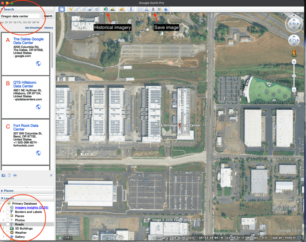
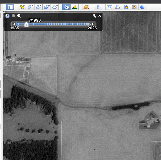
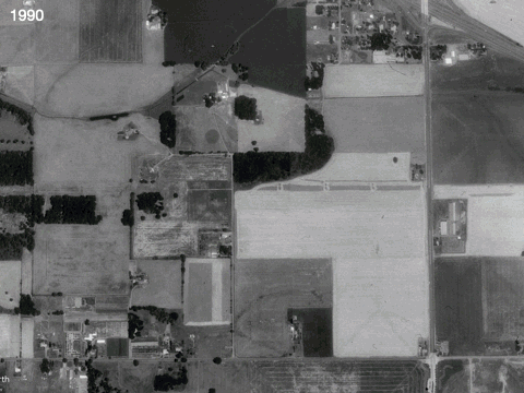
Step 3.2 In the screenshot above, look at the menu options available toward the top of the UX and find the icon that looks like a clock with an arrow indicating reversal of time. This button enables you to select historical imagery. The range of dates available at any given location is variable. In this case, historical imagery is available back to 1985 (note that depending on your purposes historical imagery may not be available at a useable resolution for your purposes). For my purposes here at this location and elevation the 1985 imagery is too low resolution, but the imagery for 1990 is fine.
Step 3.3 once you’ve found an historical starting point that works for your purposes, look for the “Save Image” Icon on the top menu of the Google Earth Pro UX (see screenshot above). Click “save image” and look at the menu options that become available. For example, you can add a map, title and description, a legend as well as scale and north arrow. For my purposes, I just want the image. Click on “Map Options” to select or deselect the options you wish to include/exclude.
Step 3.4 next, click “Save Image” and follow the menu prompts to save the file with a file name and to a location that makes sense for you. Now, you can go back to the historical imagery scrollbar of the Google Earth Pro UX and jump forward in time. As you do this, you will notice physical changes in the landscape become visible, sort of like a time lapse film. We’re going to use that analogy to create such a ‘film’ in the next steps.
Step 3.5 to create a time lapse image, you need to repeat steps 3.3 and 3.4 until you have gathered a sequence of images covering the time span you want to investigate. For this demonstration, I collected one image per year, except when I got closer to today’s year in which case sometimes I collected two or three images from the same year. I took that approach because there were changes in the landscape visible in temporal chunks as short as months or weeks. Taking this approach, I saved a total of 32 images between 1990 and 2025. Next we’re going to stitch those images together into a kind of time lapse film.
Step 3.6 to make the time lapse film I used Keynote (Apple’s built-in equivalent of PowerPoint). There are lots of different ways this step could be done. I am just offering a path that is pretty easy given it relies on built-in software and requires no coding (other versions of this pathway could use similar software such as Microsoft’s PowerPoint or free, open source software like LibreOffice).
Step 3.7 within Keynote open a new slide project and change the slide type to one for putting an image on the whole slide (other software such as PowerPoint or LibreOffice have this ability as well, although specific steps may look slightly different from Keynote).
Step 3.8 duplicate the slide type you made in Step 3.7 as many times as you need for all of the images you have collected from the Google Earth Pro image saving process (in my case that is 32 slides i.e., one slide for each Google Earth image collected in previous steps).
Step 3.9 drag and drop each saved Google Earth Pro image onto the slides in chronological order i.e., put the earliest dated image on the first slide, the second earliest image on the second slide and so forth going forward in chronological time until the last slide shows your most recent image. For demonstration purposes here I added a little text box at the top left corner of each slide showing the year the image was taken. This is a purely stylistic choice and is not needed to create the time lapse film.
Step 3.10 once you have your slides, arranged in the chronological order you want you’re ready to export them as an animated file. In Keynote there are options to export a slide show as an animated GIF as well as a movie. I am going to use the animated GIF approach. To do this, go to the “File” menu of Keynote and select “Export to” > “Animated GIF…”. Save the resulting file with a file name and to a location that make sense to you. You should now have an animated GIF file that can be opened and played by a variety of different software (see example below). Most contemporary browsers can play the file as if it were a web page, for example. You can try this by right clicking on the file and selecting open with your browser of choice.
Here’s the resulting animated GIF:
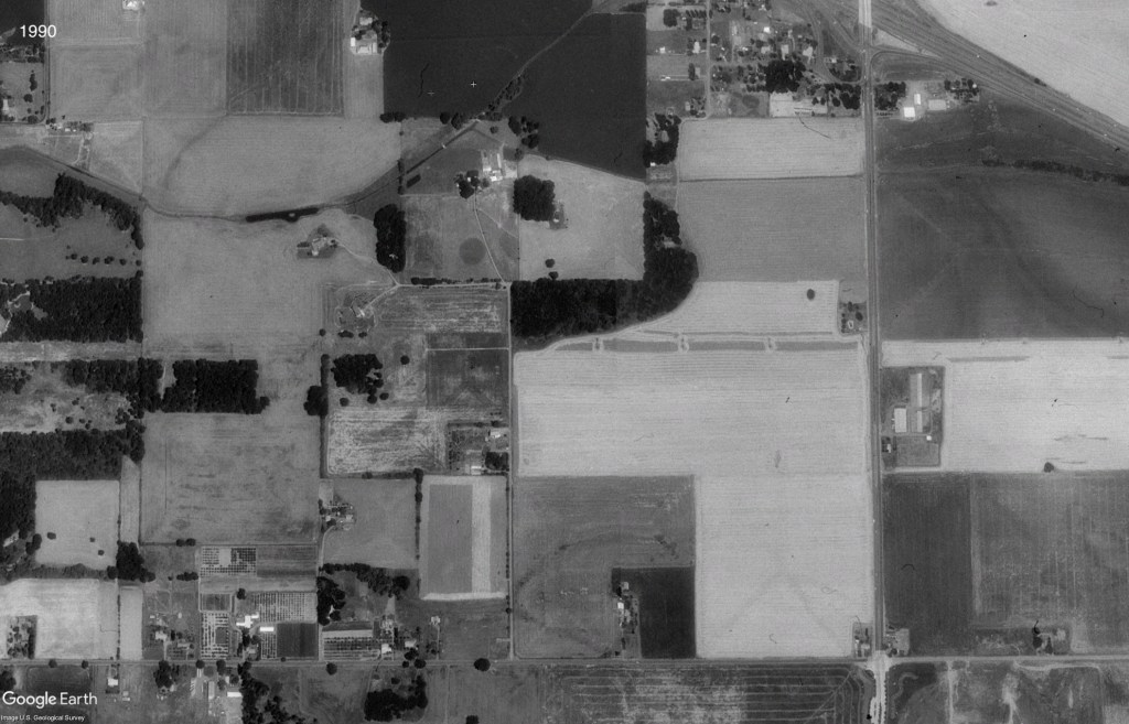
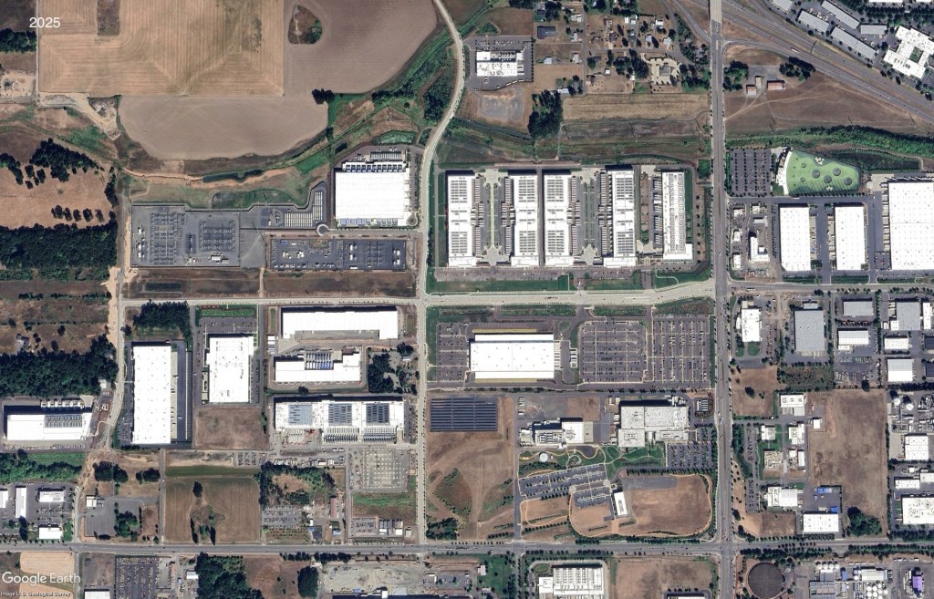
Here are static images comparing of 1990 (‘before’) and of 2025 (‘after’):
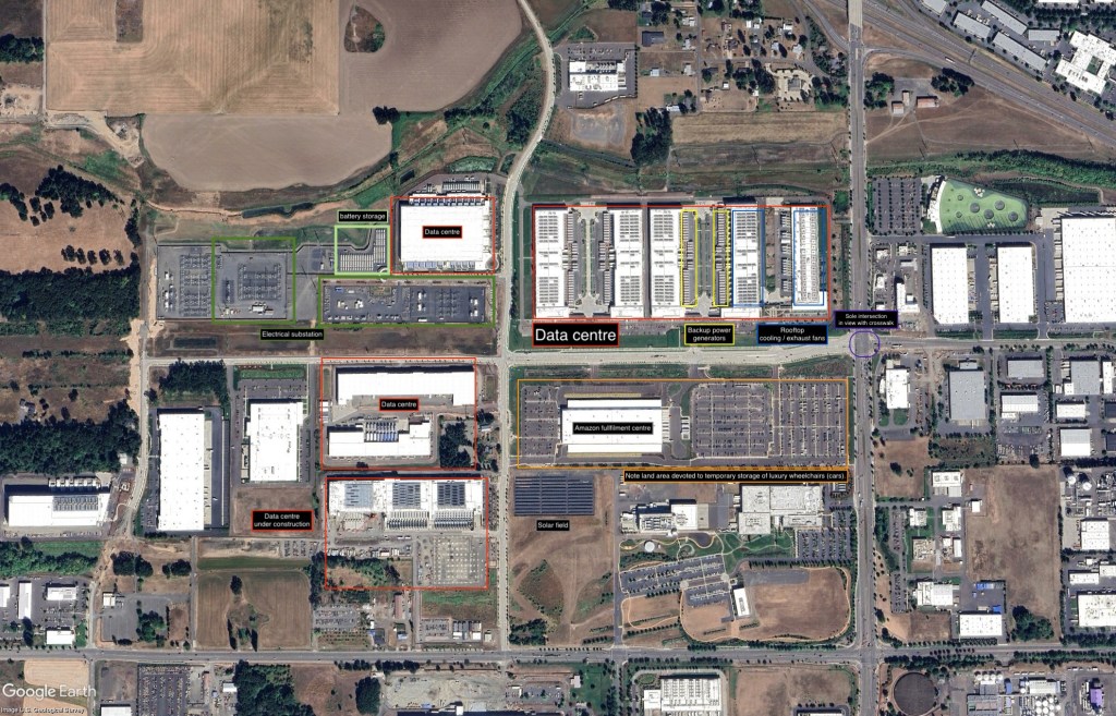
Here’s an annotated image of 2025 data with some notable features of the data centres highlighted in it:
To close out, I will emphasize that the steps described above are intended for people like me with no real coding skills and who need to rely on what someone once described to me as “point and grunt computing”. Also, the steps described above are only one way to go about this process (by way of example, one could use Google Earth Pro to extract geographical location data for features like data centres, rather than the QGIS-OpenStreet Map approach).

You must be logged in to post a comment.